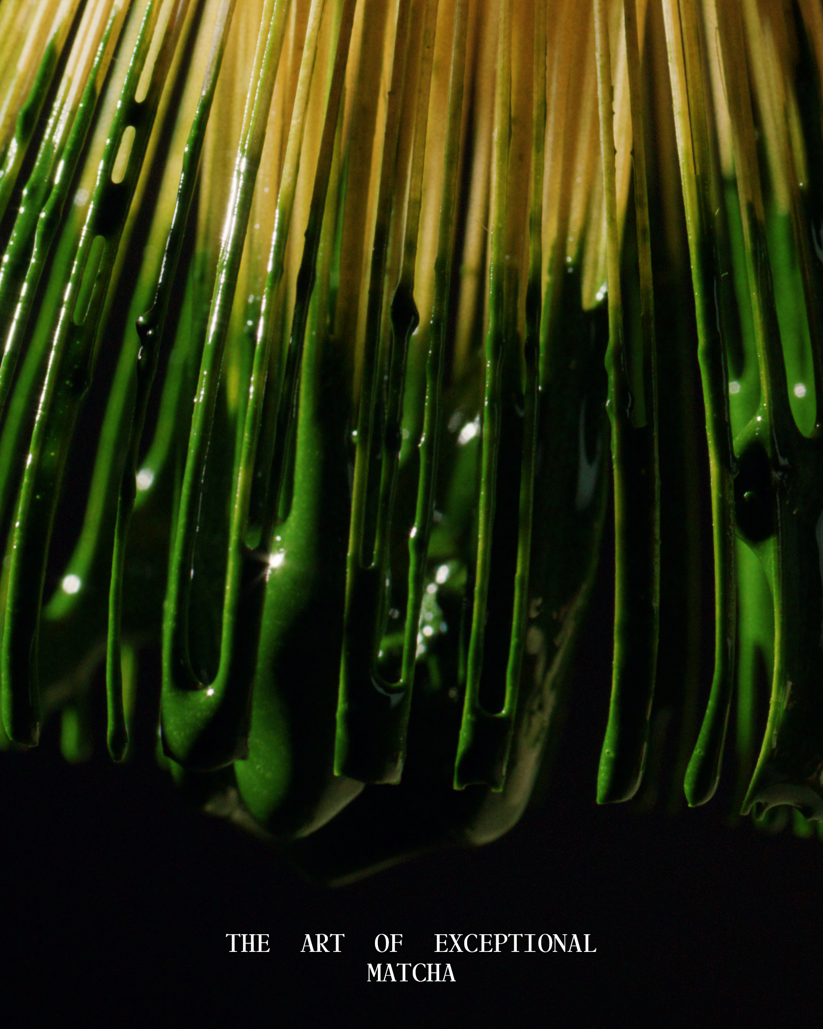
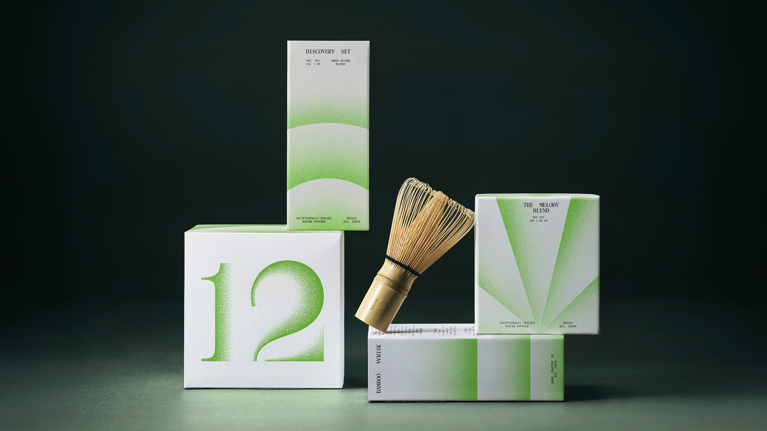
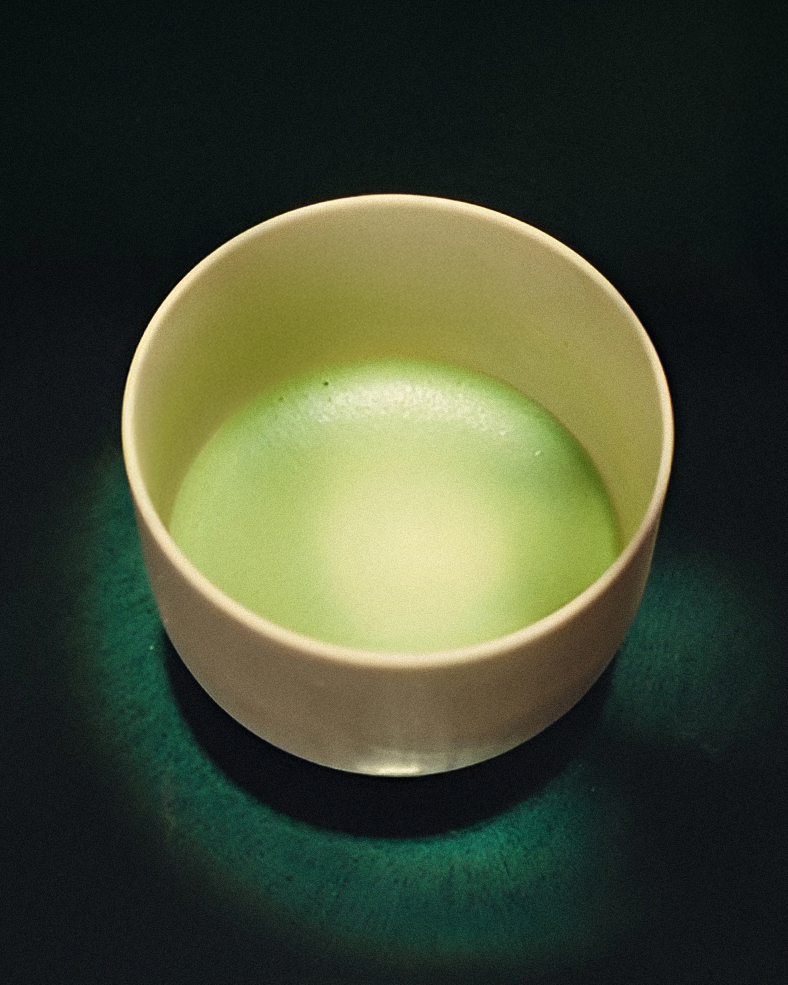
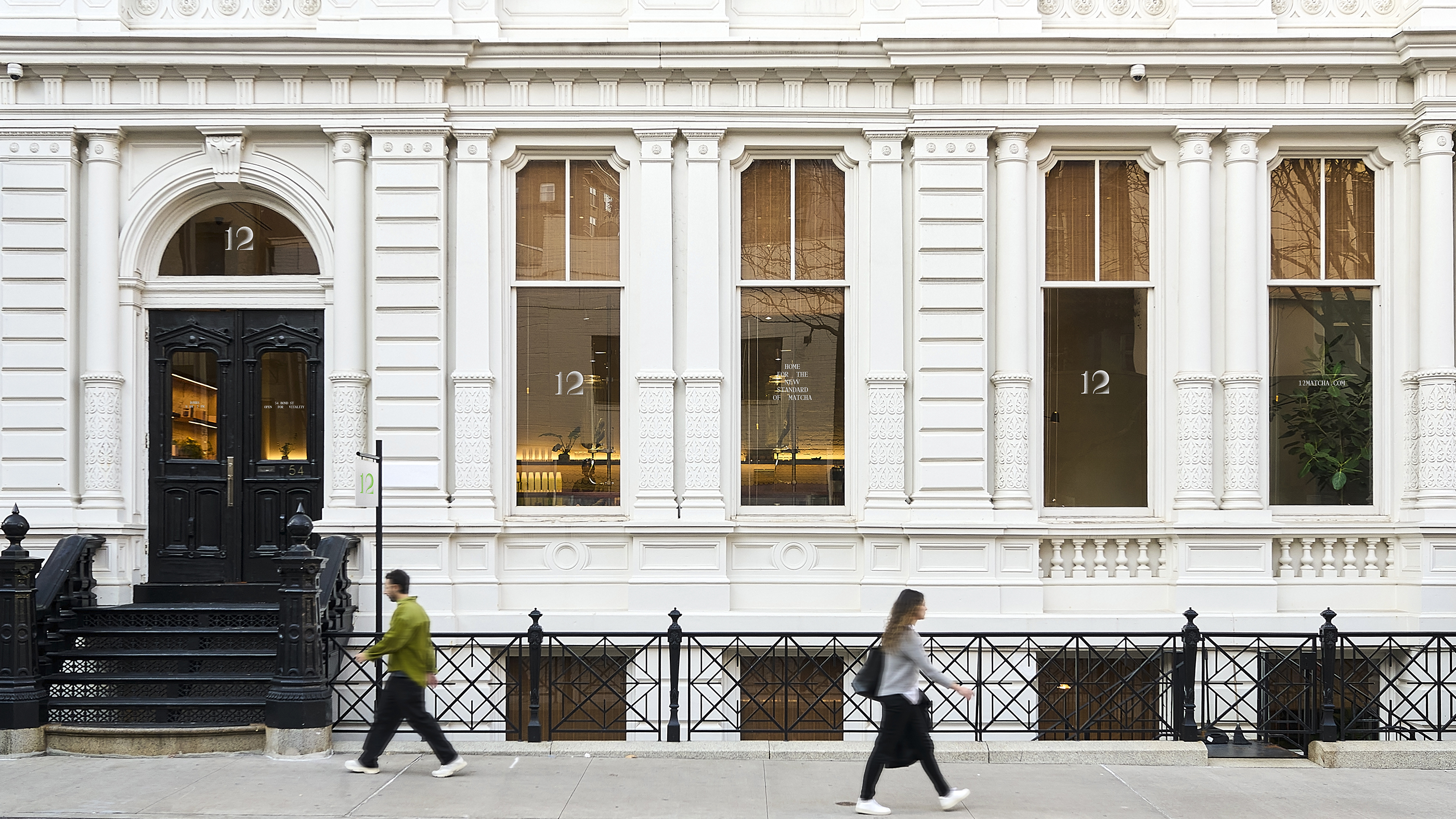
Water, air, matcha. A seemingly simple formula, yet, when crafted with the finest materials, it becomes something exquisite. 12 brings exceptional tea craftsmanship to NoHo neighborhood with its café and retail store at 54 Bond St.
In a world saturated with coffee-adjacent trends and fleeting wellness fads, how does a matcha brand cut through the noise? 12 was never meant to be just another option on the menu – it was conceived as a moment of calm, a reset, a way to bring vitality back into daily life. Base and the 12 team envisioned the brand as more than a product – it's an experience to be savored.
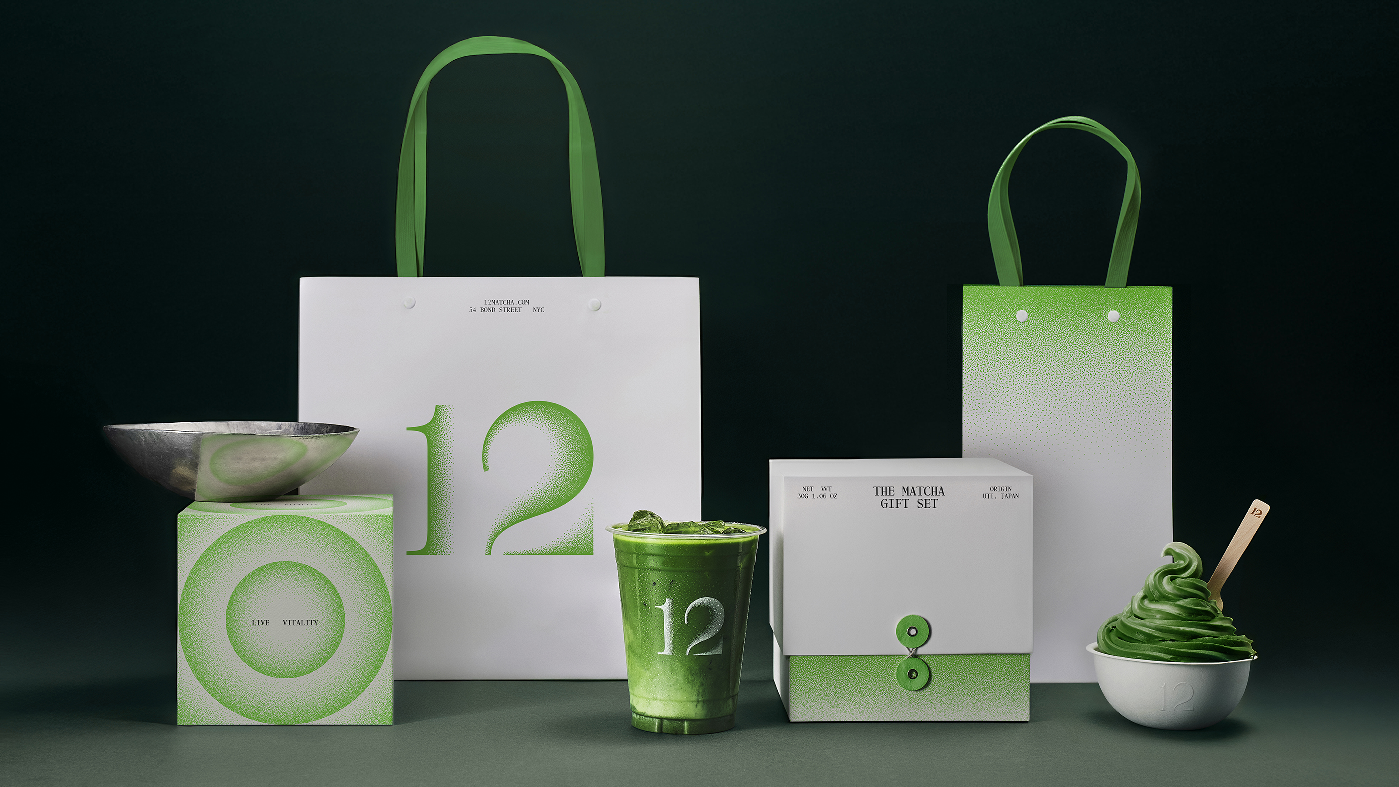
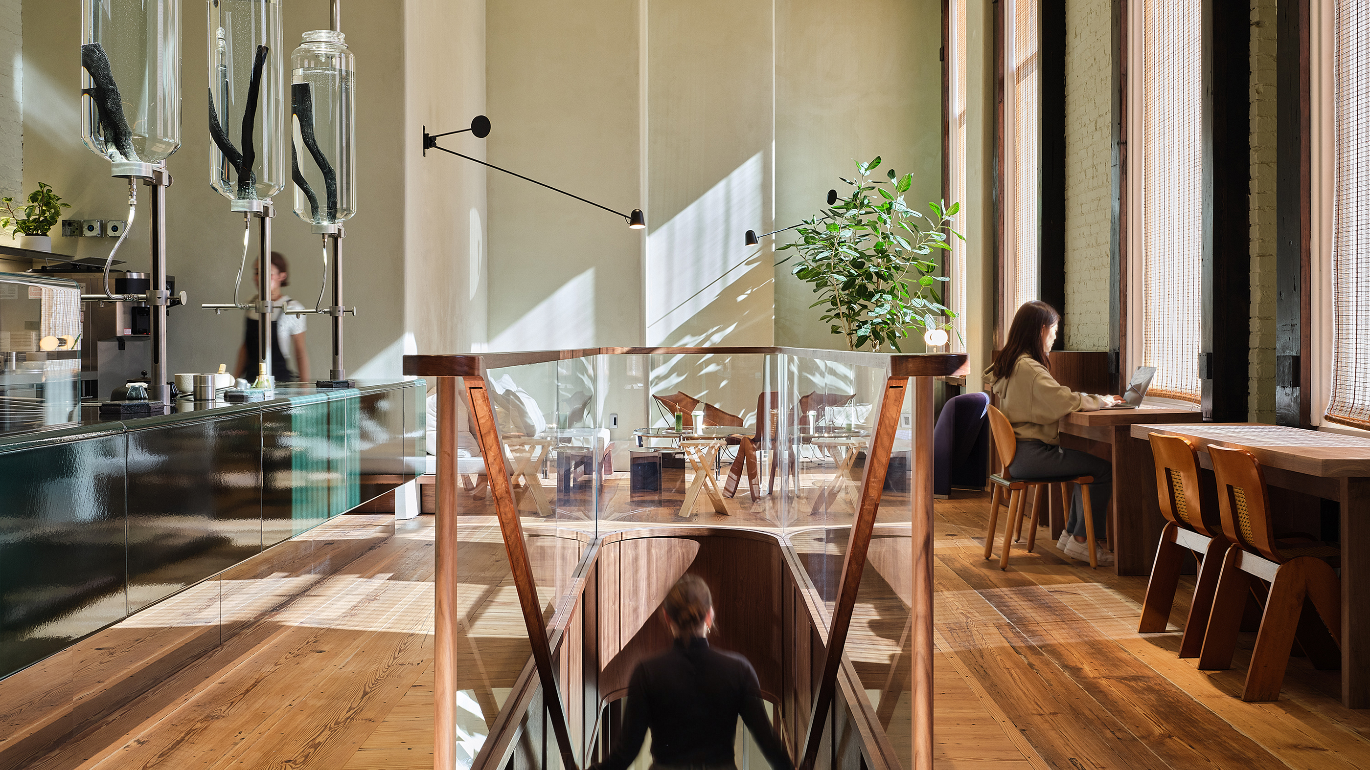
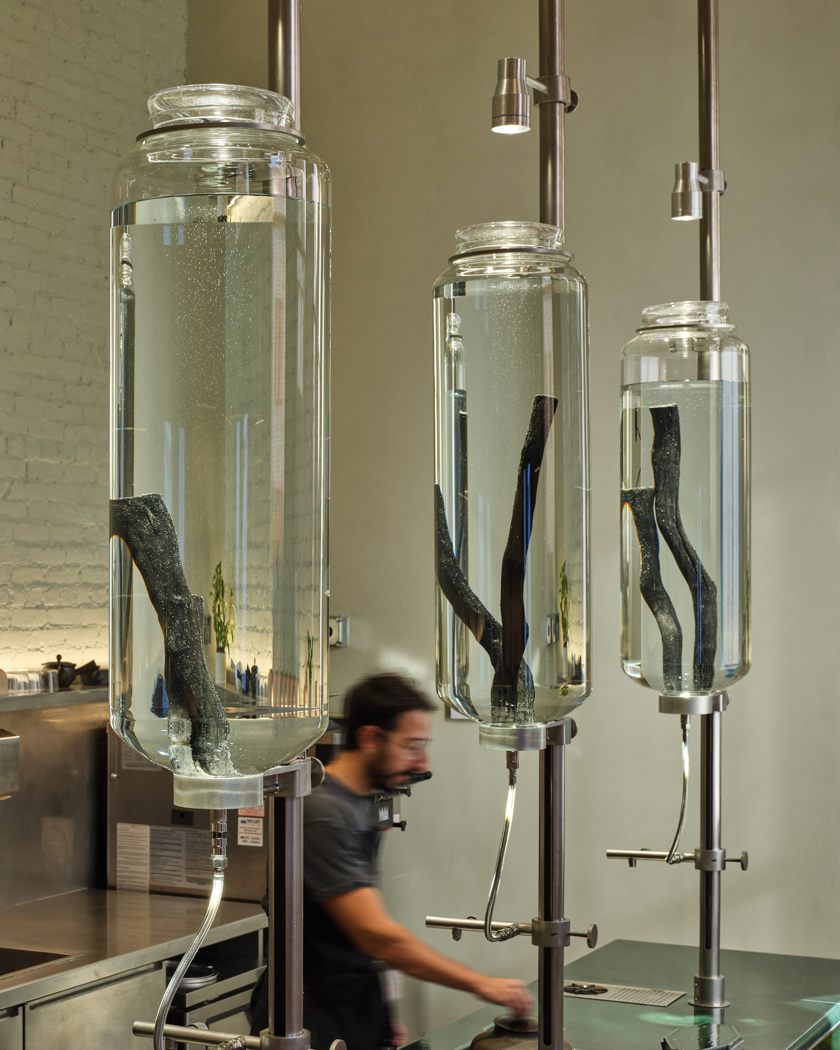
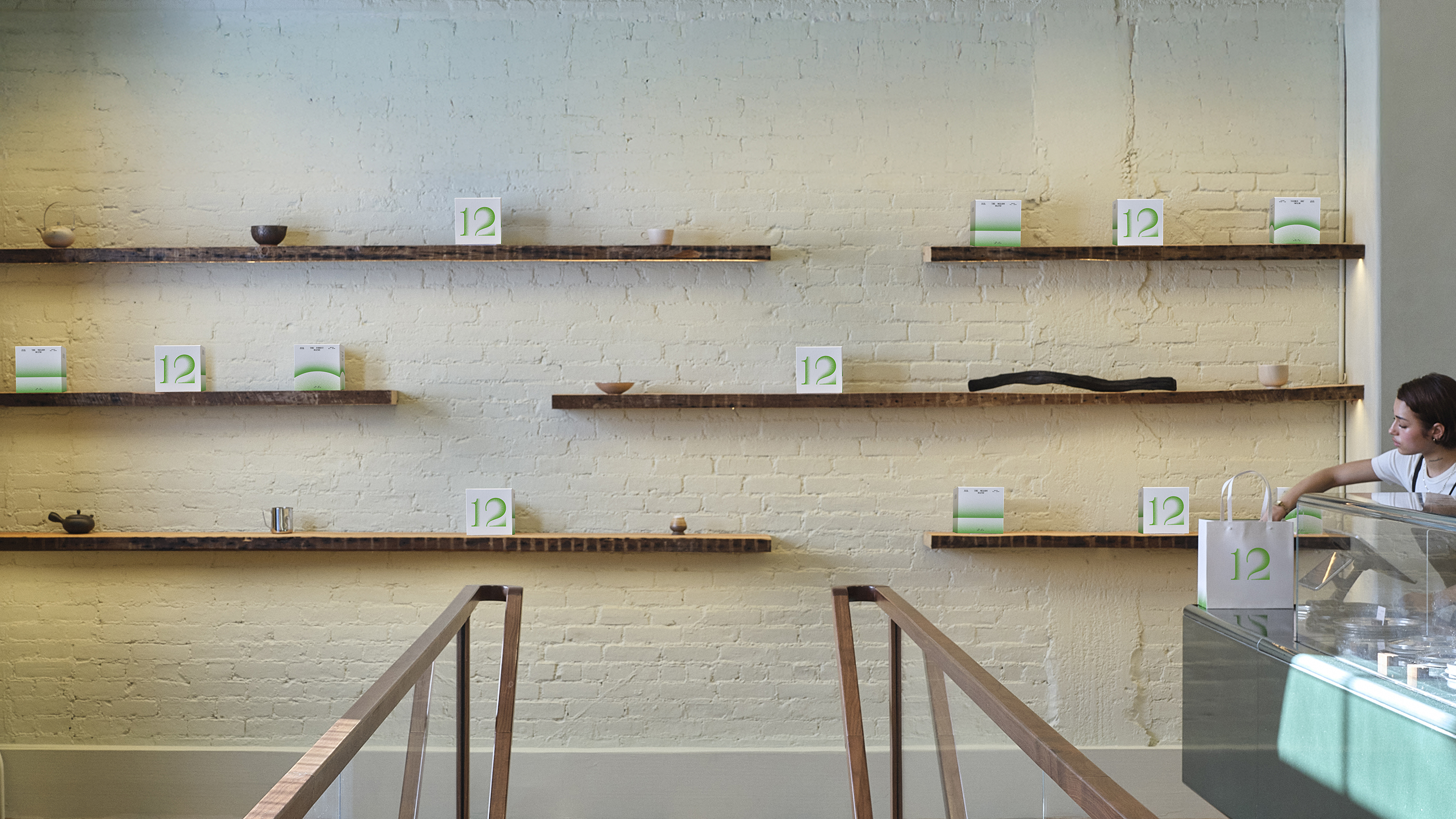
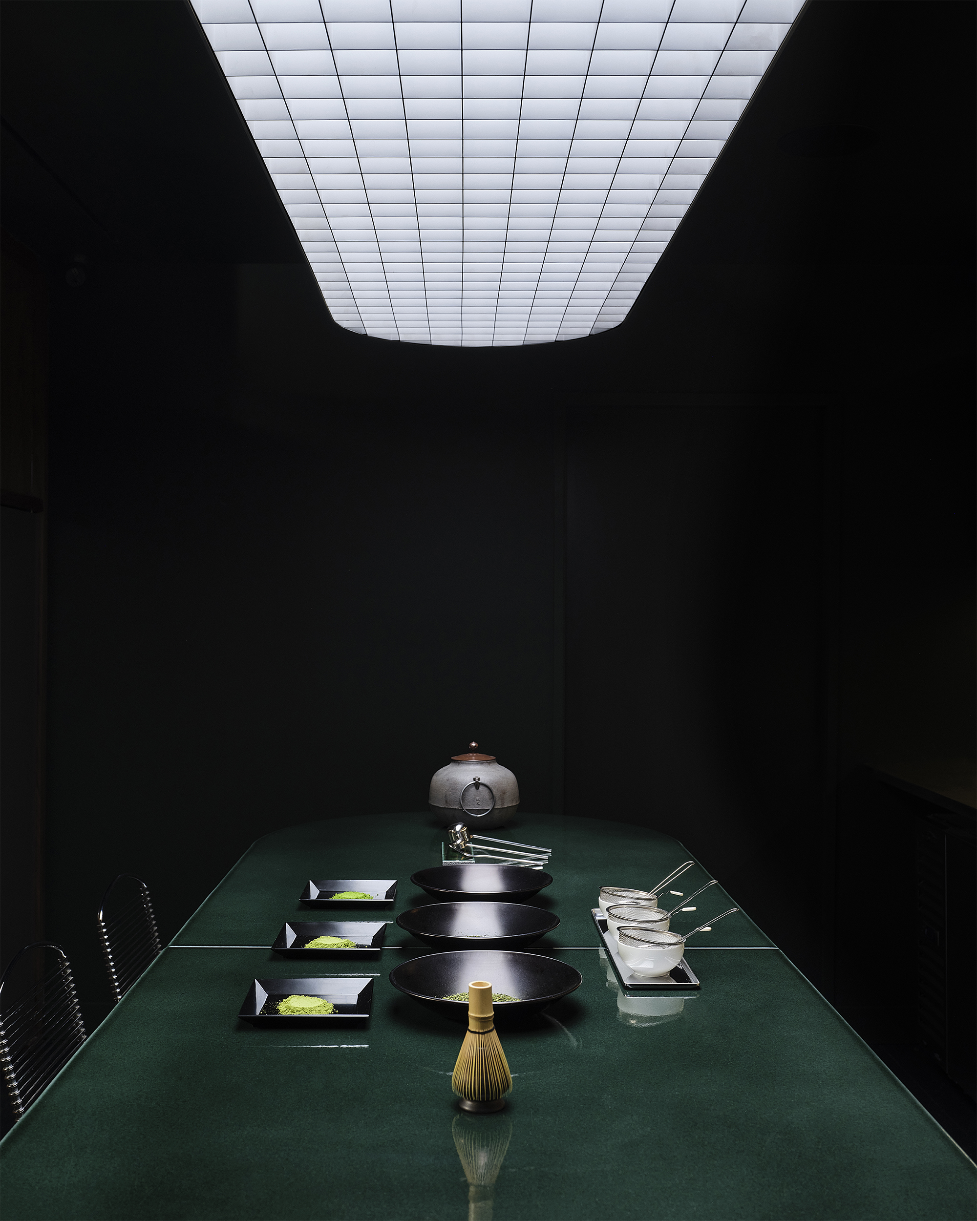
Base didn’t just create the brand – we helped assemble the ecosystem around it. From packaging to interior design to the in-store journey, every element was designed to make 12 a category of its own.
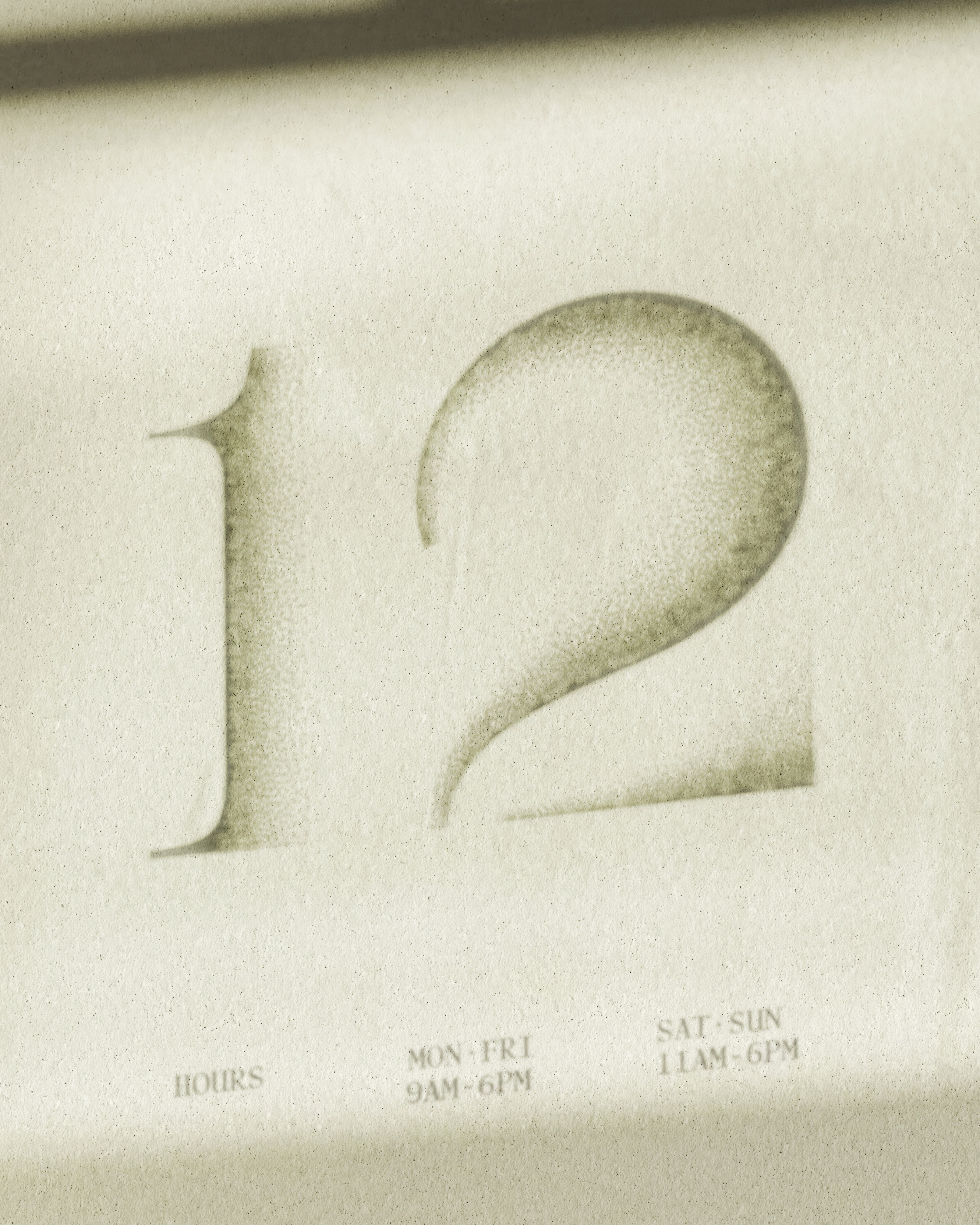
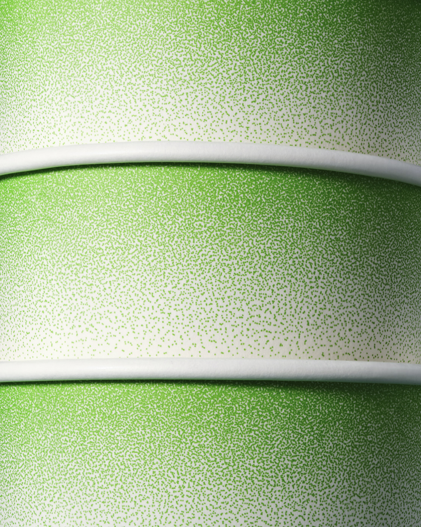
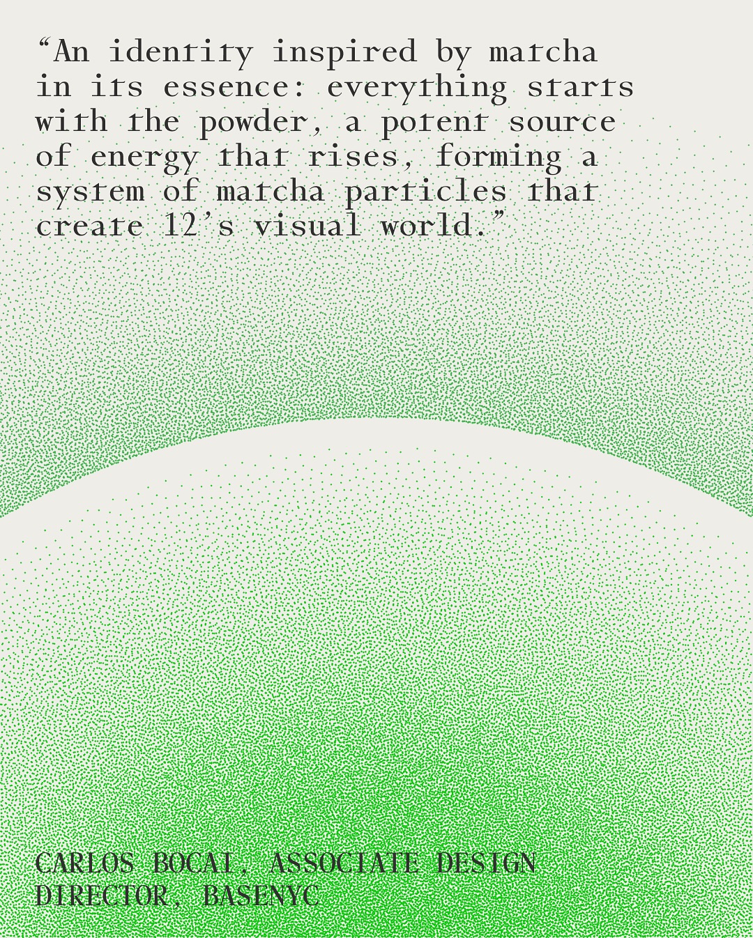
Visually, BaseNYC took a bold approach – leaning into green as a symbol of vitality and serenity with intentional use of white space to set the tone. A visual identity system inspired by matcha on its essence: everything starts with the powder, a potent source of energy that rises, culminating in a system with matcha particles that form the logo and other visual elements.
In a world saturated with coffee-adjacent trends and fleeting wellness fads, how does a matcha brand cut through the noise? 12 was never meant to be just another option on the menu – it was conceived as a moment of calm, a reset, a way to bring vitality back into daily life. Base and the 12 team envisioned the brand as more than a product – it's an experience to be savored.
Base didn’t just create the brand – we helped assemble the ecosystem around it. From packaging to interior design to the in-store journey, every element was designed to make 12 a category of its own.
Visually, BaseNYC took a bold approach – leaning into green as a symbol of vitality and serenity with intentional use of white space to set the tone. A visual identity system inspired by matcha on its essence: everything starts with the powder, a potent source of energy that rises, culminating in a system with matcha particles that form the logo and other visual elements.
12 Matcha
Base, 2025
Creative Director: Min Lew
Associate Creative Director: Ross Gendels
Associate Design Director: Carlos Bocai
Design: Darius Wang, Harry Laverty, Kristina Bartosova
Digital Director: Mirek Nisenbaum
Account: Harry Laverty
Strategy: Sarah Labuda
Copywriting: Katerina Mery
3D: Alec Burns
Architecture: Cigue
Case Study Design: Wu Tong, Romain Bourillon
Case Photography & Film: Michal Carbone, Brennan Freed
Food Styling: Sean Dooley


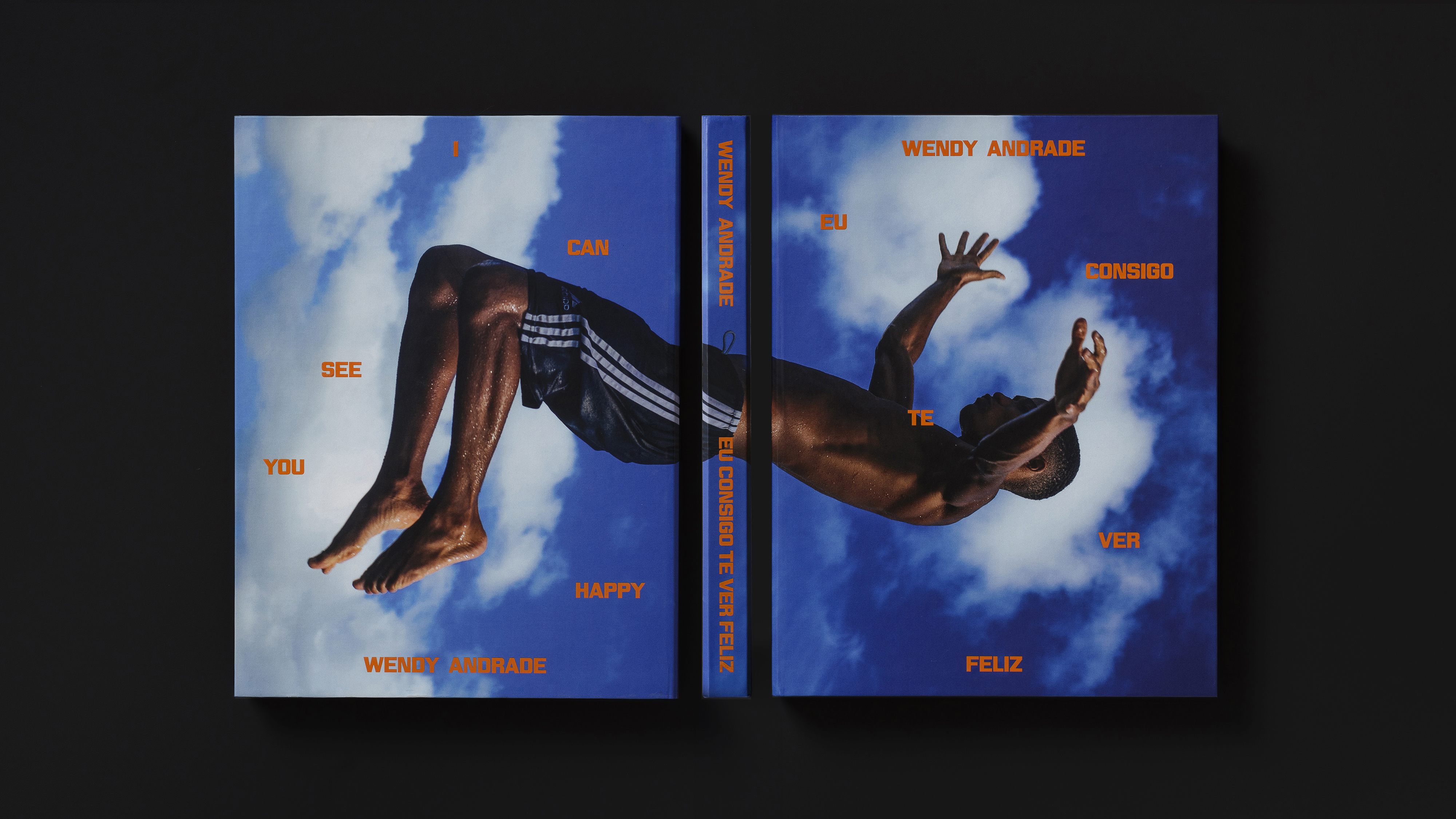
Eu Consigo Te Ver Feliz is the first book by Brazilian photographer and artist Wendy Andrade. Published by Act., the book brings together photographs of choreographed jumps and contemplative scenes of Black youth on the beaches of Rio de Janeiro and Salvador. Paired with the artist’s poetry and essays by Ana Paula Vitorio and Eder Chiodetto, the images explore the sea as a symbol of resistance, ancestry, playfulness, and transformation.
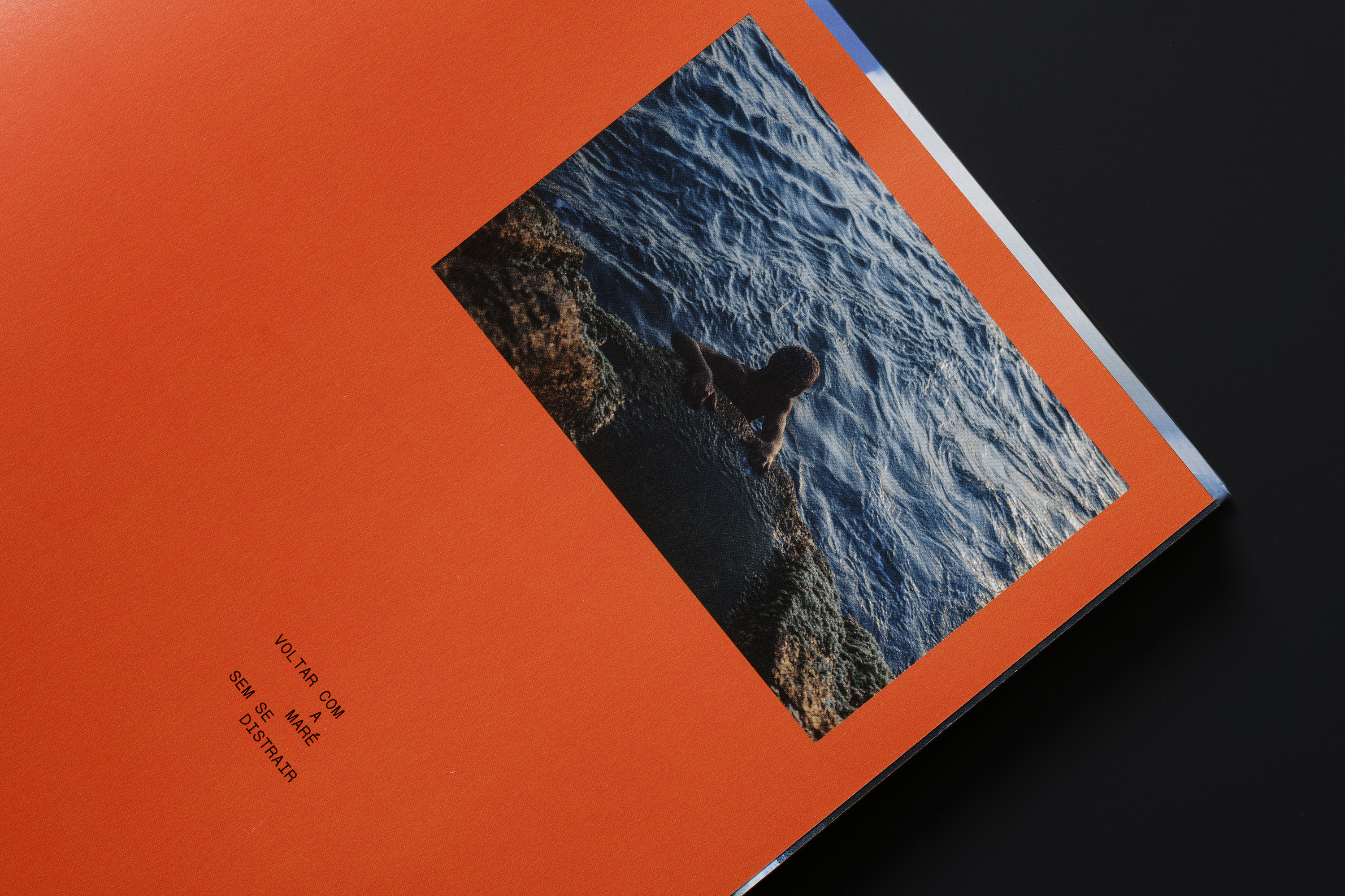
Inspired by visual poetry, the design layers voices and narratives, with Wendy’s voice at the center. The layouts and compositions capture the movement of the body and the flow of time, while a shifting color palette—from orange to blue—mirrors the sky’s transformation across a day.
Inspired by visual poetry, the design layers voices and narratives, with Wendy’s voice at the center. The layouts and compositions capture the movement of the body and the flow of time, while a shifting color palette—from orange to blue—mirrors the sky’s transformation across a day.
Eu Consigo Te Ver Feliz (I Can See You Happy)
cbjbworks, 2025Awards
ADC Silver Cube
Editorial Design: Carlos Bocai, Julia B. Aguiar, Lucas D’ascenção
Editorial Coordination: Vitor Casemiro
Print Production: Lilia Goes
Case Study Photography: Nino Andres Biazzo
Essays: Ana Paula Vitorio, Eder Chiodetto
Typography: The Neue Black by Vocal Type
Maxeville by SM.Foundry


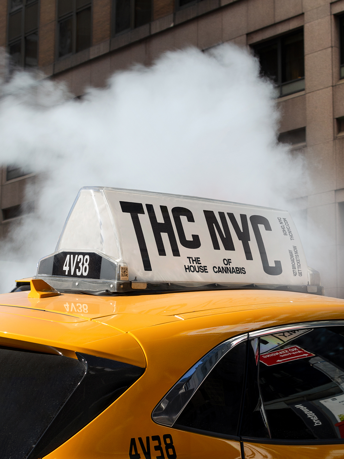
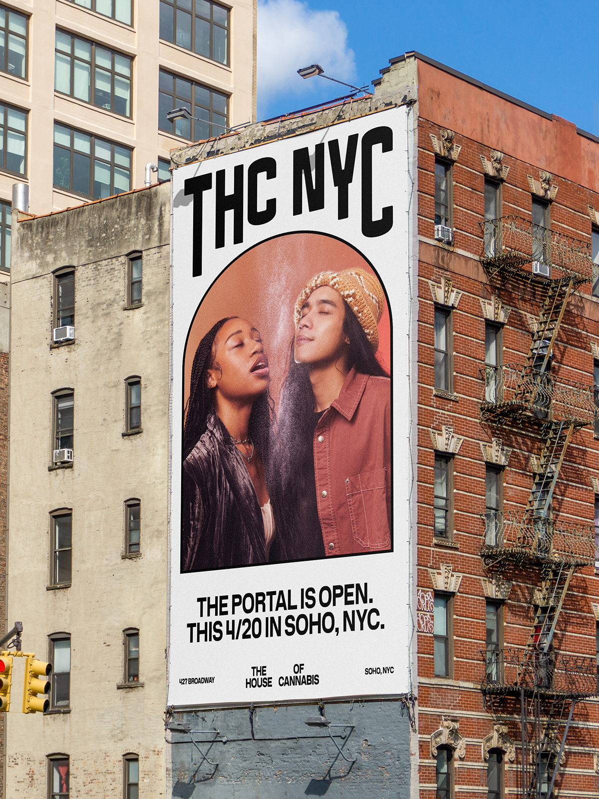
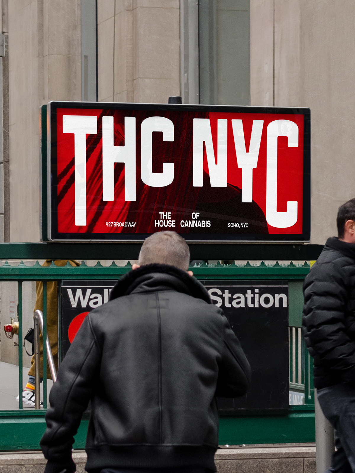
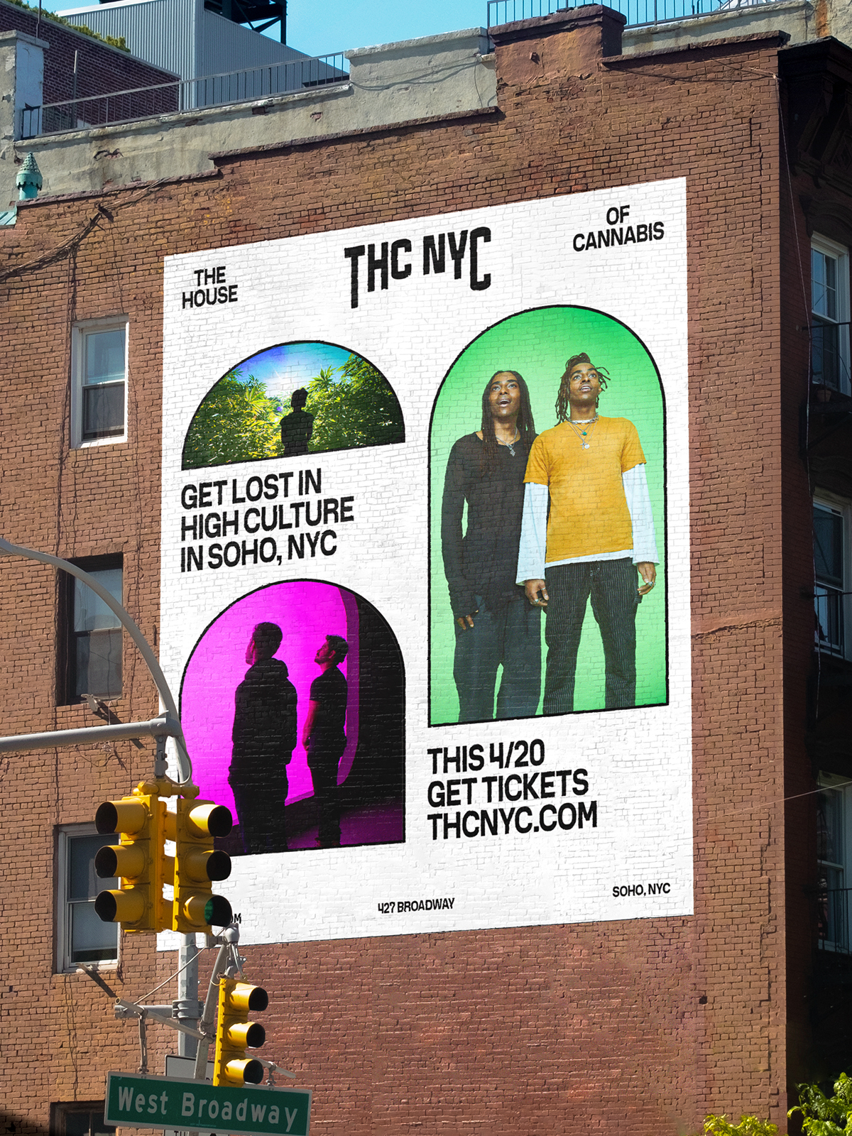
A portal into the many dimensions of cannabis
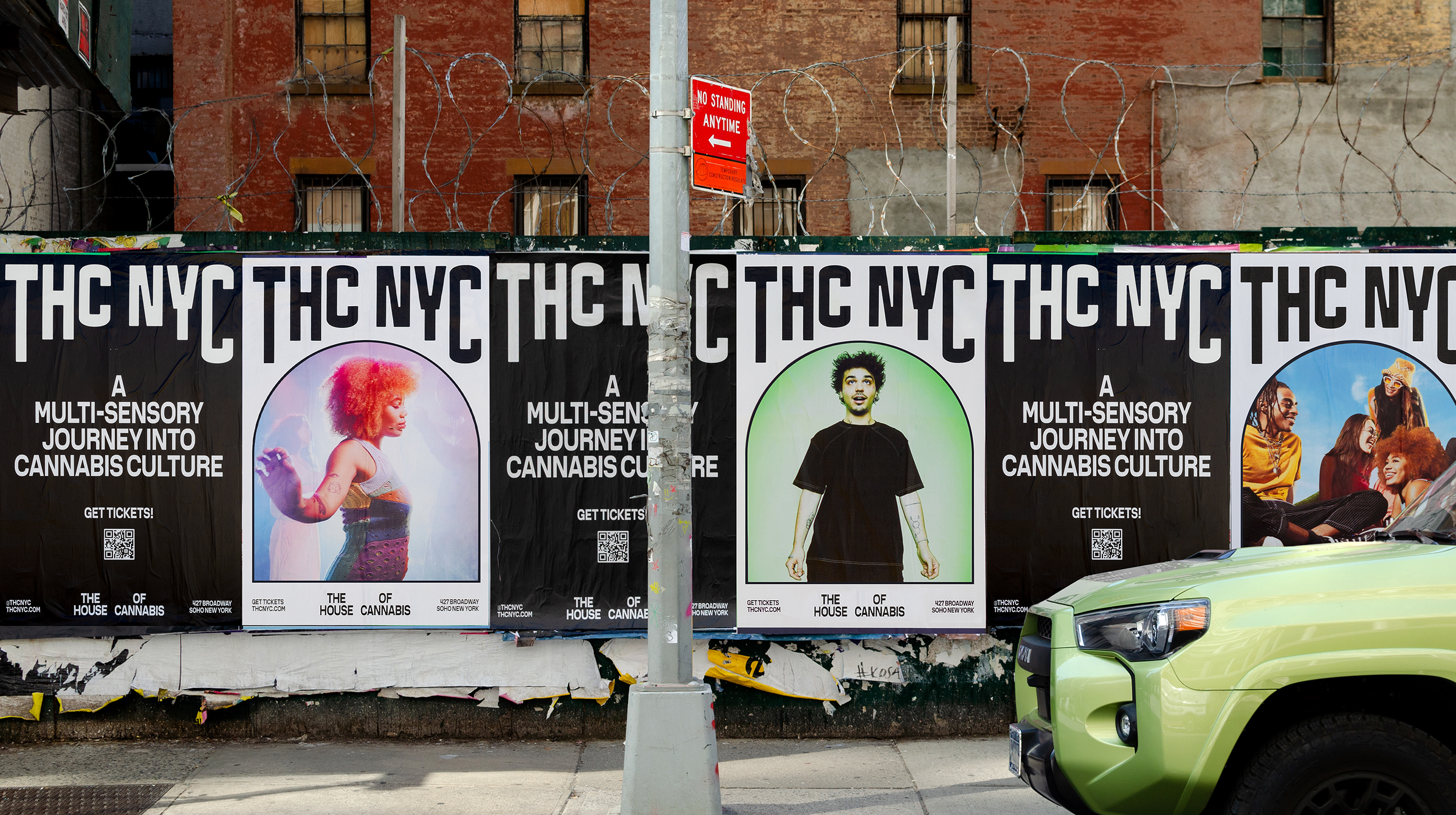
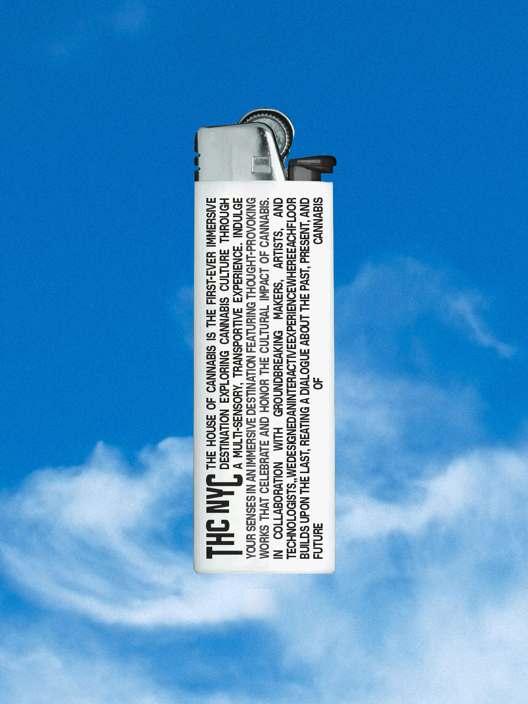
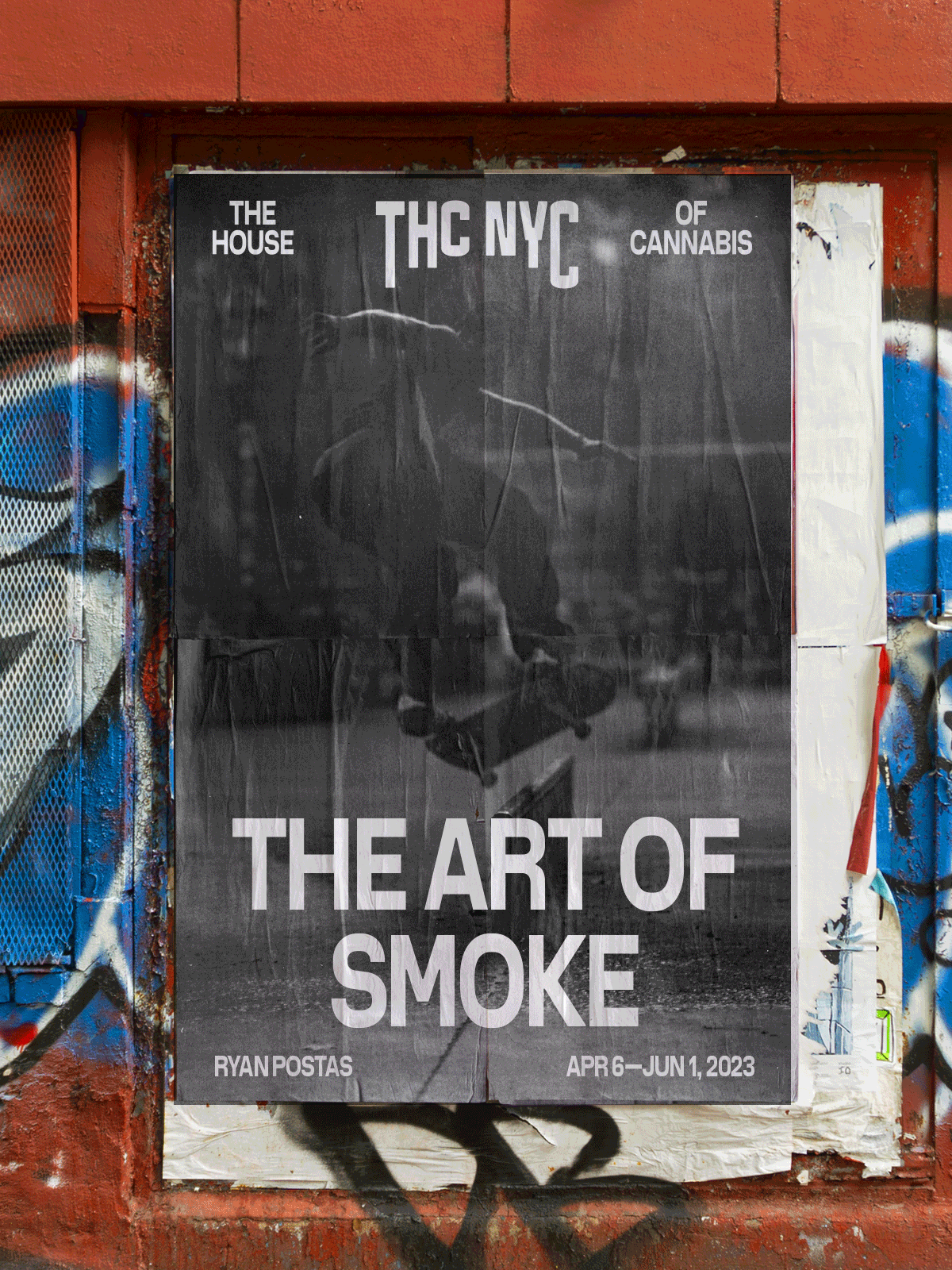
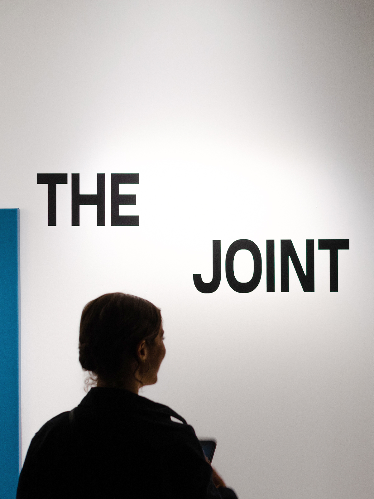
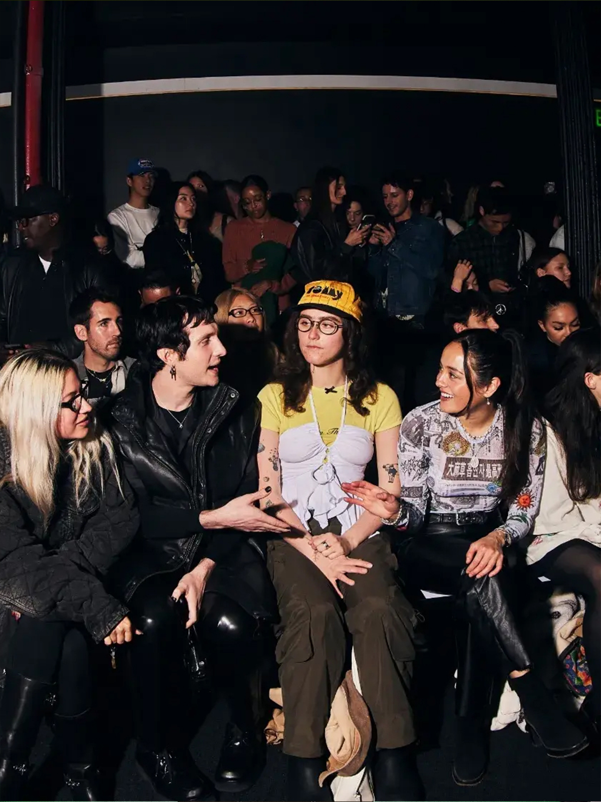
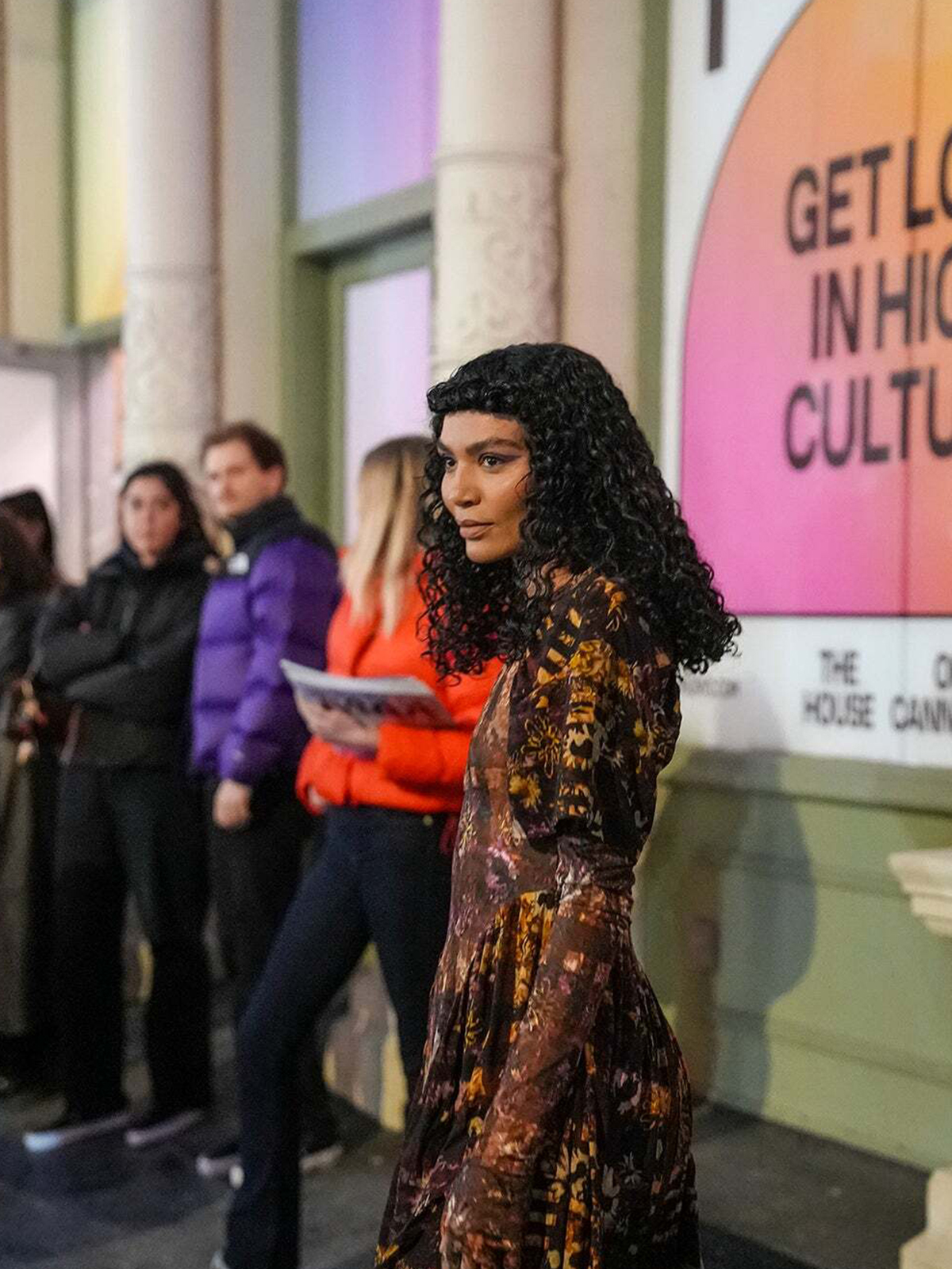
A new multi-sensory and experiential destination that explores the many facets of cannabis culture has landed in New York’s Soho. Offering five floors of unique exhibitions and experiences, THC NYC aims to be a beacon of “high” culture, and our identity helps to transport visitors out of the ordinary and immerse them in the extraordinary.
Against the backdrop of a major shift from subculture to mainstream, The House of Cannabis (THC NYC) founders acknowledged early on the key role this unique “museum” will play in breaking stigma, changing perceptions, and elevating cannabis culture both for experienced and newly curious audiences. Its visual identity therefore needed to facilitate all of these elements, while avoiding so many potential cliches and tropes.
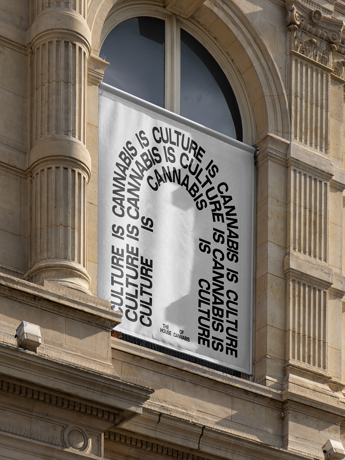
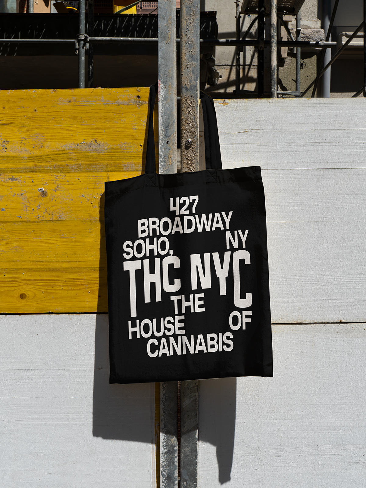
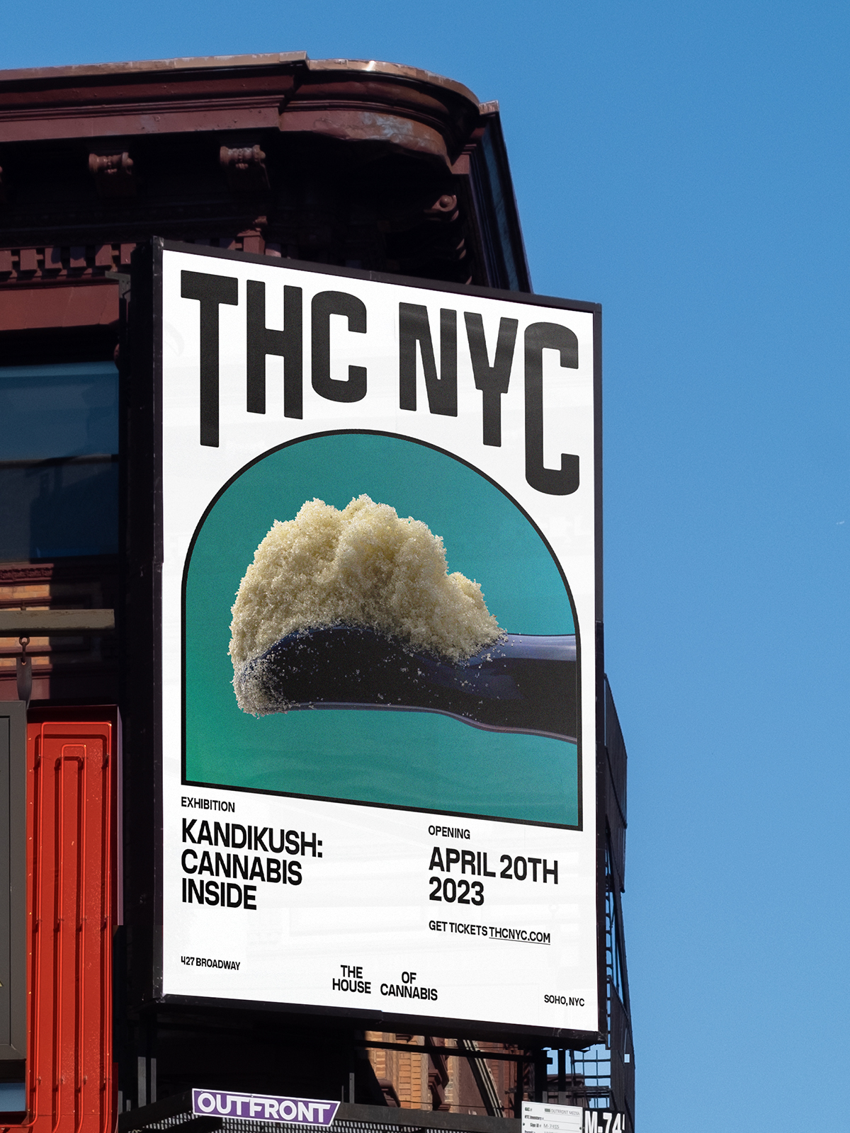
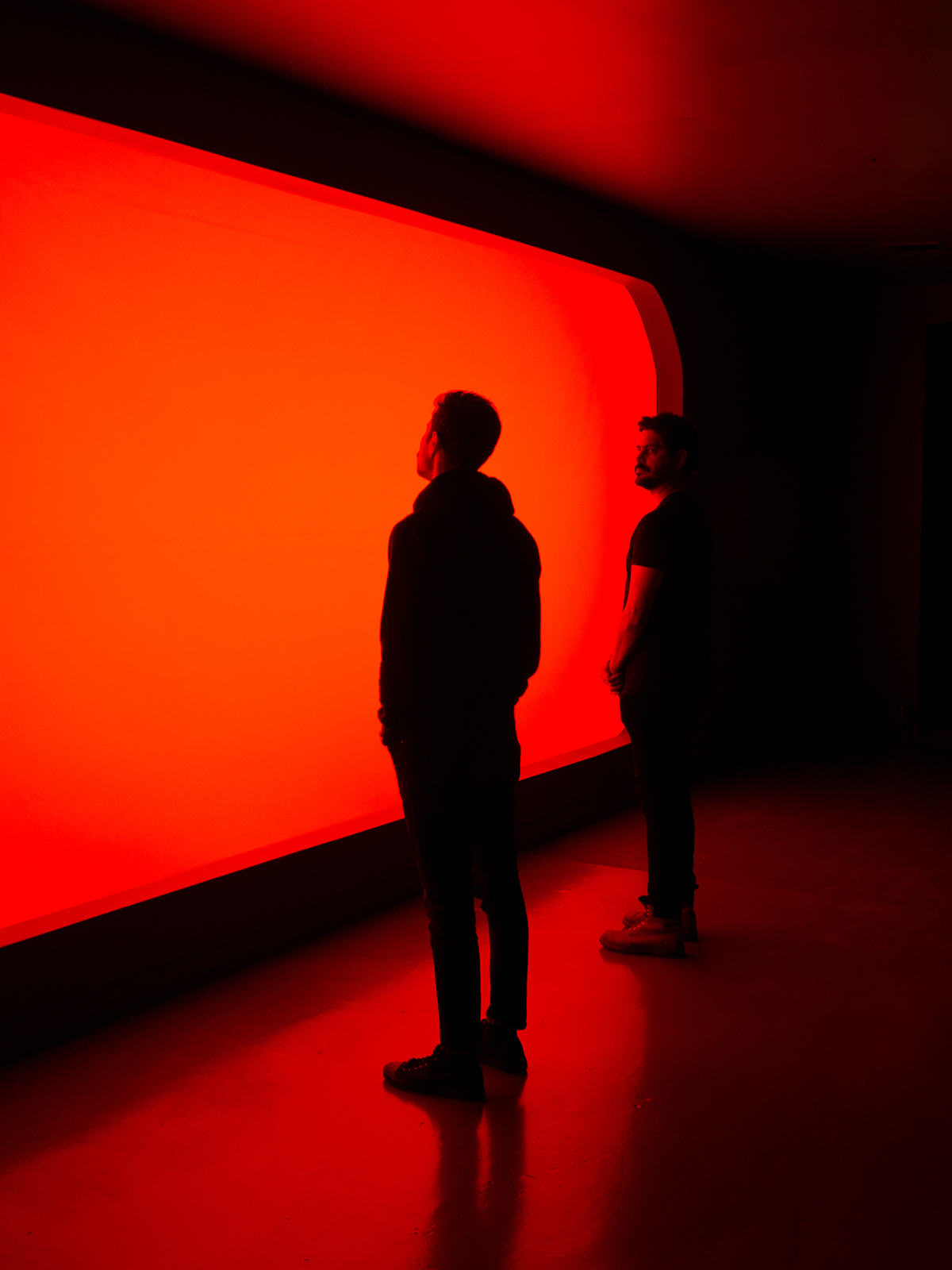
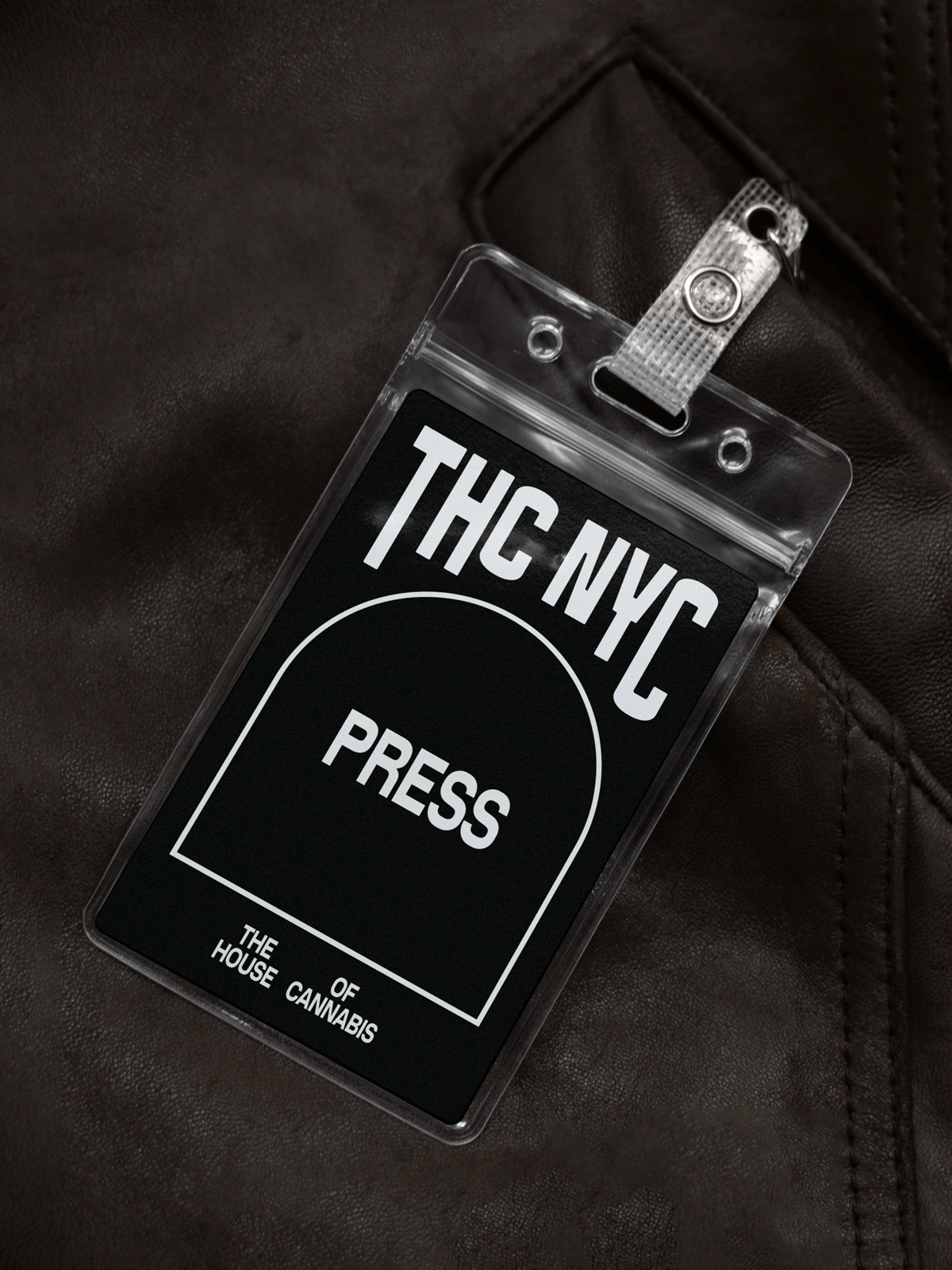
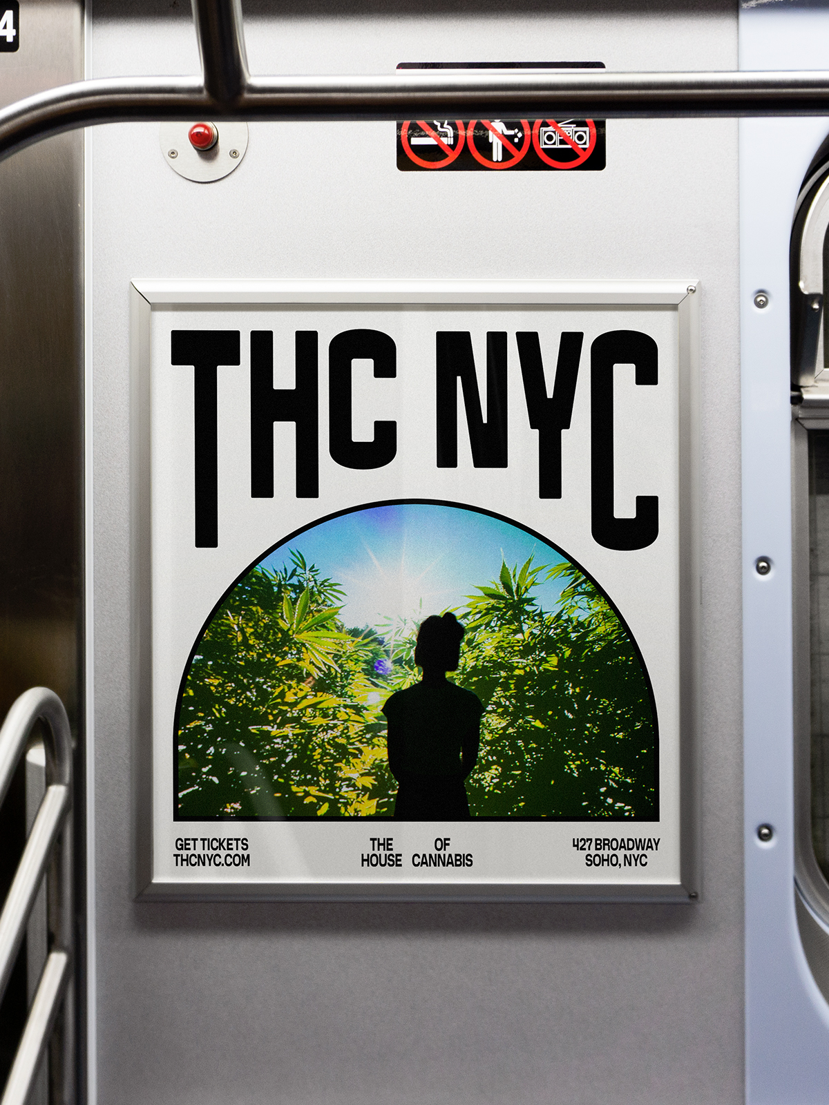
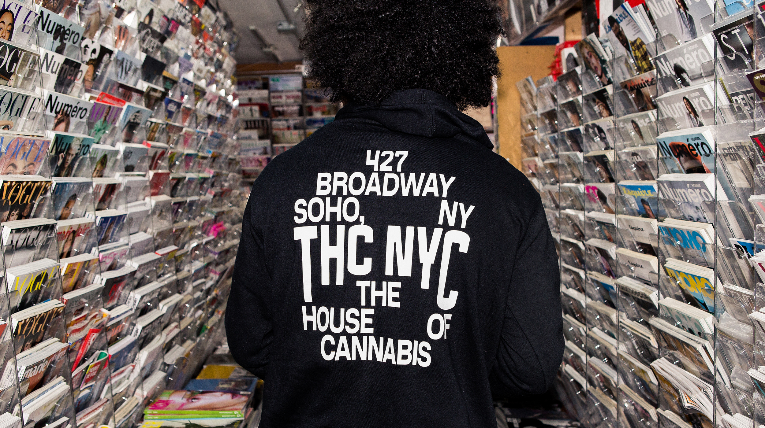
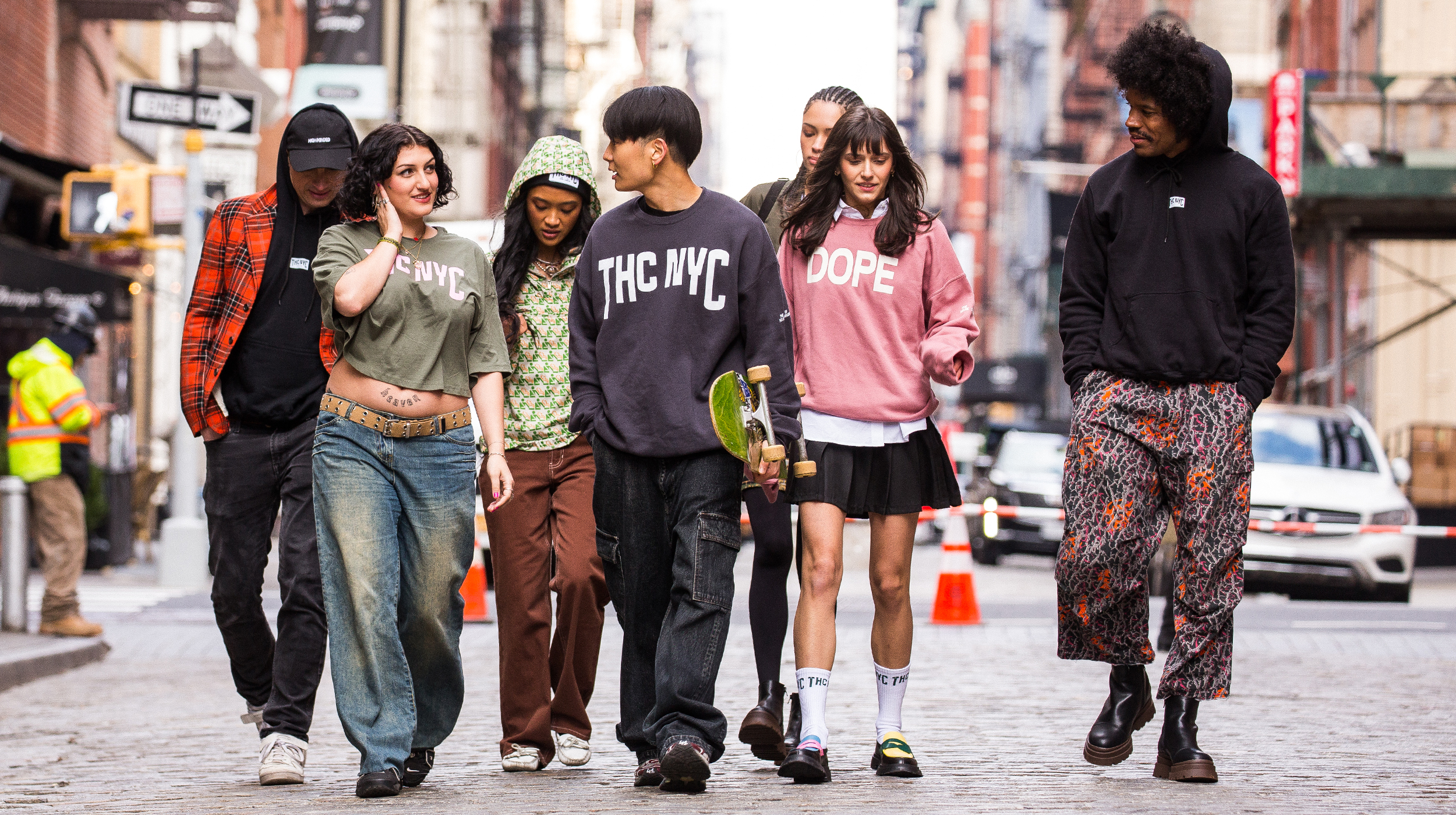
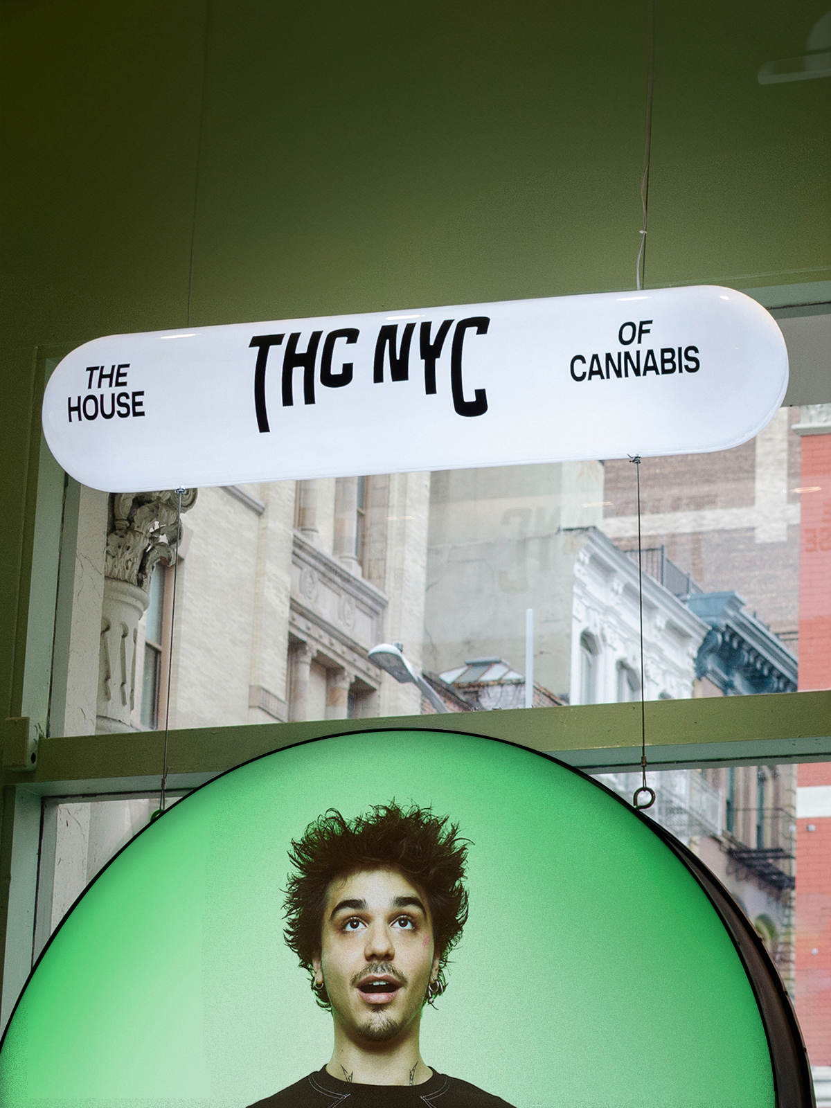
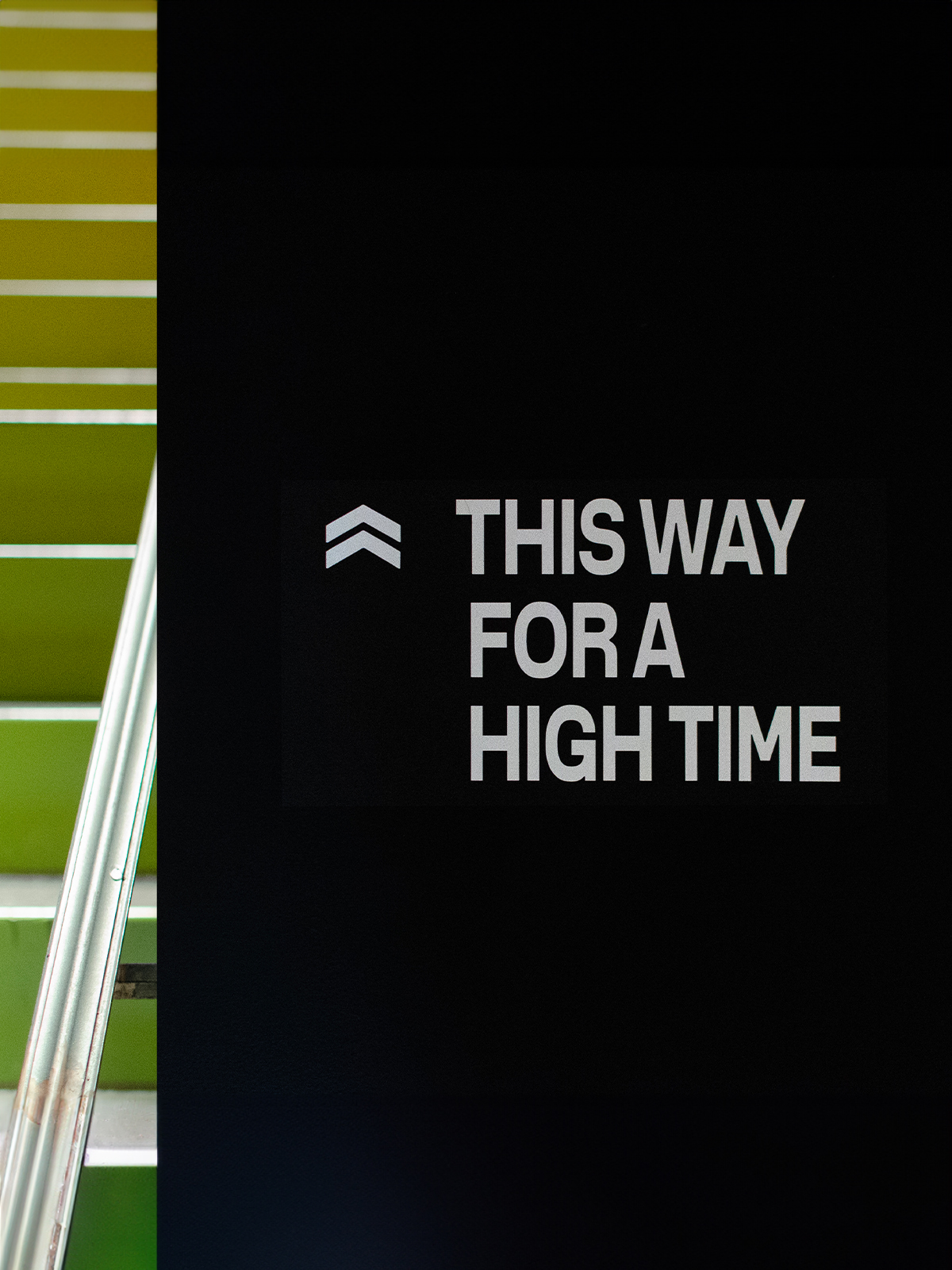
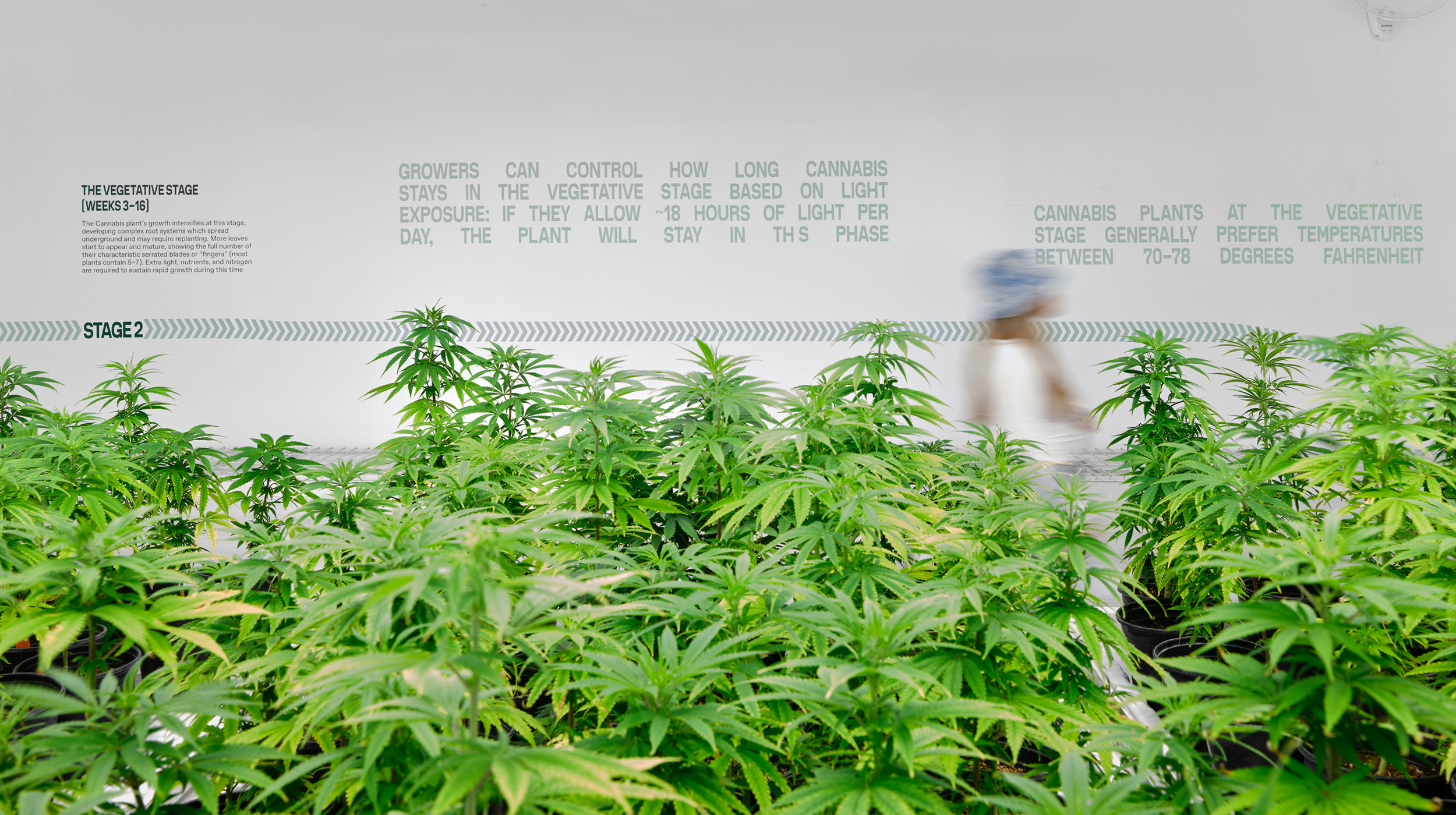
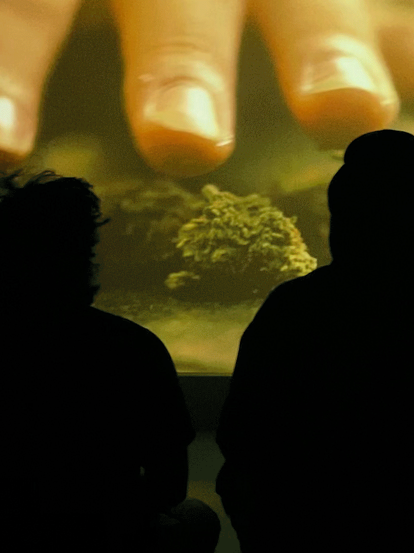
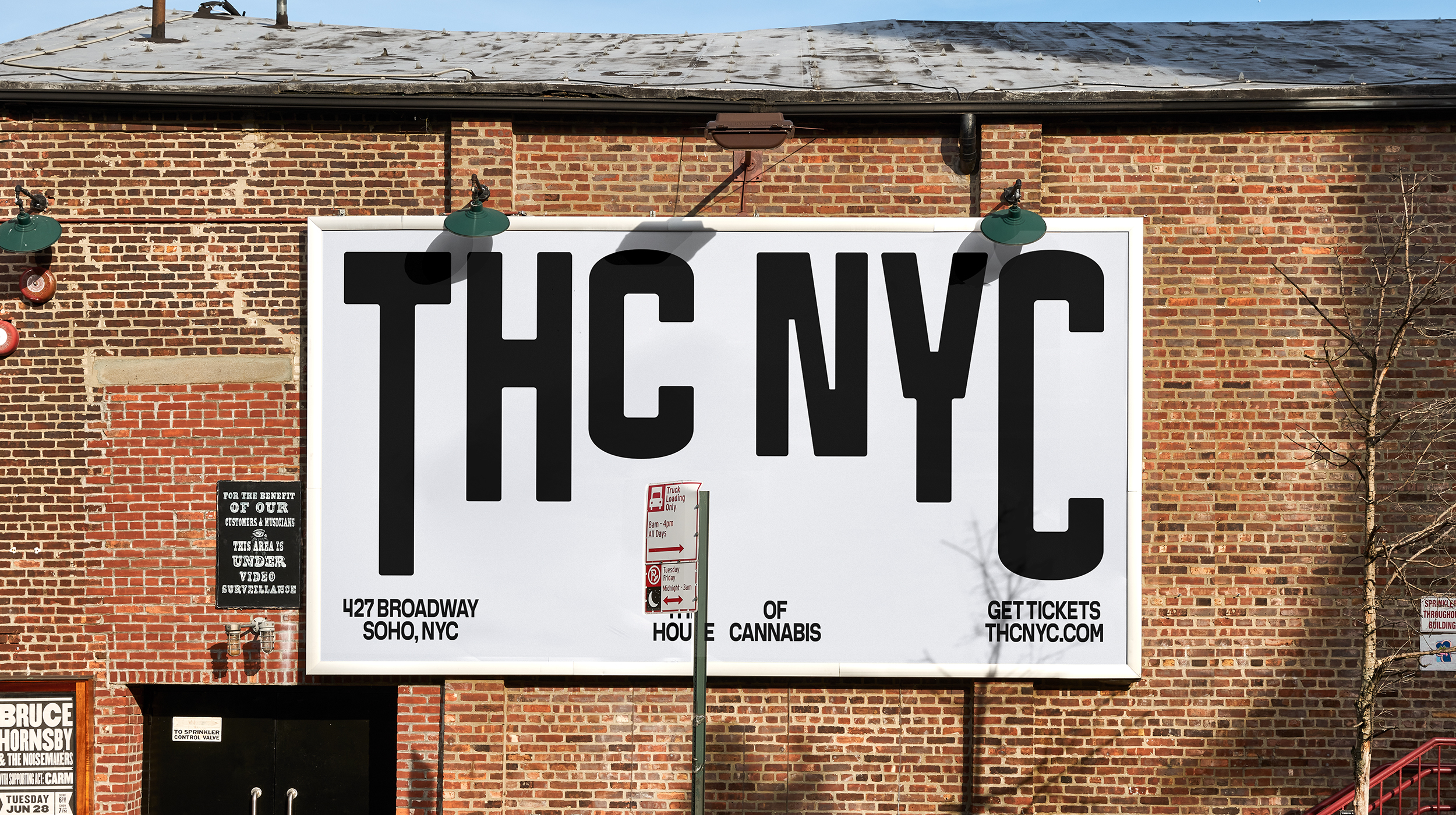
Base touched almost every brand aspect: from naming and strategy, to the website and merchandise—all centered around communicating the museum as a place that’s experiential and educational; a cultural institution rather than a dispensary. Since cannabis can transport the mind to different places, the iconic arched windows of the house’s historic building at 427 Broadway were an obvious tie-in to represent portals to other realms. This shape informed a tight visual framework that revolves around a flexible motif, used to either contain or frame a wide range of content, and acting as both a conceptual and a literal window into the world of THC NYC.
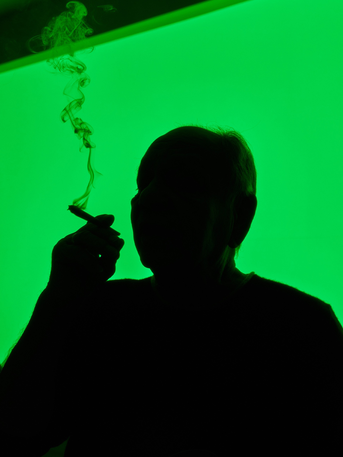
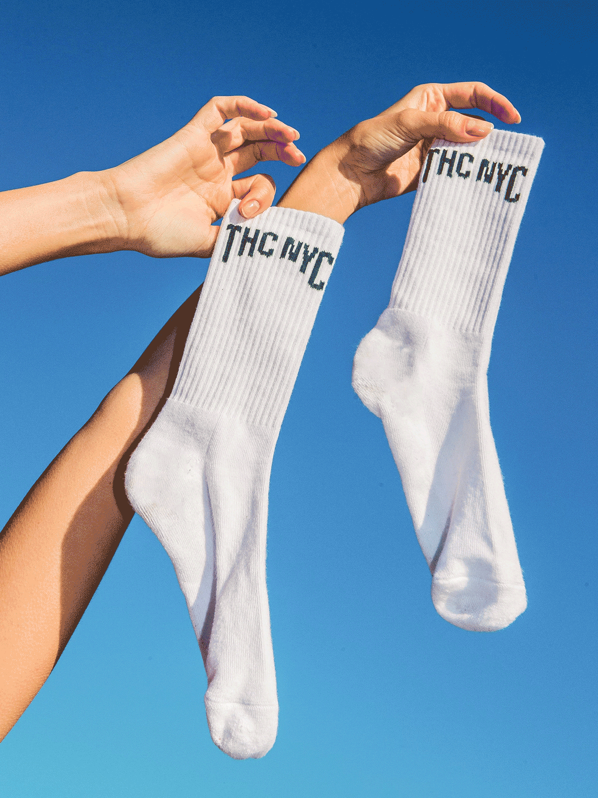
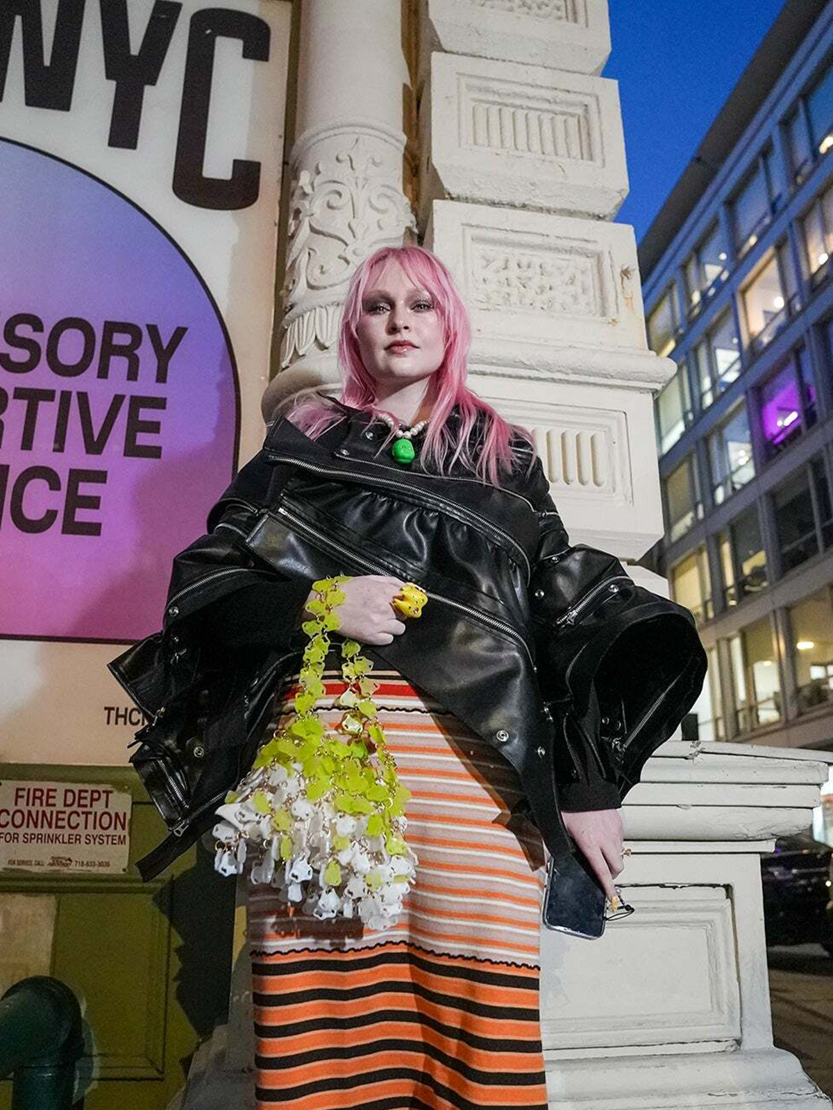
A custom typeface speaks to urban culture, with plenty of attitude, and merch was created with a streetwear sensibility. For the art direction, clouds represent the ethereal, and also act as euphemisms for smoke, while color gradients evoke the feeling of ever-changing moods and constant discovery.
A new multi-sensory and experiential destination that explores the many facets of cannabis culture has landed in New York’s Soho. Offering five floors of unique exhibitions and experiences, THC NYC aims to be a beacon of “high” culture, and our identity helps to transport visitors out of the ordinary and immerse them in the extraordinary.
Against the backdrop of a major shift from subculture to mainstream, The House of Cannabis (THC NYC) founders acknowledged early on the key role this unique “museum” will play in breaking stigma, changing perceptions, and elevating cannabis culture both for experienced and newly curious audiences. Its visual identity therefore needed to facilitate all of these elements, while avoiding so many potential cliches and tropes.
Base touched almost every brand aspect: from naming and strategy, to the website and merchandise—all centered around communicating the museum as a place that’s experiential and educational; a cultural institution rather than a dispensary. Since cannabis can transport the mind to different places, the iconic arched windows of the house’s historic building at 427 Broadway were an obvious tie-in to represent portals to other realms. This shape informed a tight visual framework that revolves around a flexible motif, used to either contain or frame a wide range of content, and acting as both a conceptual and a literal window into the world of THC NYC.
A custom typeface speaks to urban culture, with plenty of attitude, and merch was created with a streetwear sensibility. For the art direction, clouds represent the ethereal, and also act as euphemisms for smoke, while color gradients evoke the feeling of ever-changing moods and constant discovery.
THC NYC — The House of Cannabis
Base, 2023Press
Creative BoomVisuelle
Brand New
Creative Direction: Min Lew
Account Lead: Anthony Carson
Copywriting: Katerina Mery
Brand Identity: Ross Gendels. Carlos Bocai
Website: Mirek Nissenbaum, Ross Gendels, Carlos Bocai, Anjela Freya,
Andrey Starkov. Daria Tischenko. Artem Lyusti, Rinat Abdrakhmanov,
Sergei Khegai, Taya Ivanova, Mitya Sudakov
Merchandise: Ross Gendels, Carlos Bocai, Shirlin Kao, Jun Hong
Motion Design: Yeon Ryo
Strategy: John Hearn
Custom Type: Razzia Type
Lifestyle Photography: Phoenix Johnson
Case Study Photography: Carlos Bocai
Content: Terrane Group


Wendy Andrade is a Brazilian artist whose practice drifts between photography, poetry, film, and books. His work holds tensions: tender yet political, quiet yet overflowing with emotion. Through portraits, words, and moving images, he celebrates Black identity and beauty with rare intimacy.
The ocean is the connective thread in his work, and it became our source. It’s reflected in the details — from DaVinci and its watery serifs to the photo series that overlap like waves. Every refresh creates new combinations of text and image — always shifting, poetic, and ephemeral, inviting the user to see, read, feel, and dive into it all.
Moments of quiet contemplation give way to gentle waves as you scroll, the interface dissolving softly like water in sand before rushing into faster, louder cascades. Scroll, and the current carries you forward. Pause, and the surface calms. Poems appear in narrow streams, full-bleed photographs flood into the edges, and films and books gather in quiet pools.
More than a website, it is a living digital composition – a continuous image-poetry flow that reflects Wendy’s universe. Rather than a showcase of Wendy’s work, the site acts as an extension of it. A vessel built to hold emotion in motion, a digital body that remembers every tide and reflection, and lets them rise anew each time you arrive.
Wendy Andrade Website
Base, 2025Creative Direction: Min Lew, Mirek Nisenbaum
Design Director: Carlos Bocai
Design: Wu Tong, Ferran Feixas
Project Manager: Harry Laverty
Base DGTL: Andrey Starkov, Daria Tishchenko, Sergey Lisovskiy
Type: DaVinci by Virgile Flores, Roumald by Erkin Karamemet
Video Soundtrack: Baby 95 - Liniker
Brazilian Homo #2 is an independent publication celebrating queer Brazilian identity and culture. Created by editor Juliano Corbetta, the project brings together photographers, artists, and creatives to document Brazil’s LGBTQIA+ community through an intimate and unfiltered lens.
Building on the visual foundation of the first issue designed by PORTO ROCHA, the second edition expands the world of Brazilian Homo beyond the magazine itself—introducing title cards, stickers, posters, and limited-edition merch, with proceeds supporting LGBTQIA+ causes in Brazil. New themes are introduced throughout the publication, each paired with a distinct typographic voice, creating small visual universes within the larger world of Brazilian Homo. Distributed internationally across cities such as Paris, Tokyo, London, Barcelona, and New York, the project continues to amplify Brazilian voices as a rare documentation of contemporary queer culture.
Building on the visual foundation of the first issue designed by PORTO ROCHA, the second edition expands the world of Brazilian Homo beyond the magazine itself—introducing title cards, stickers, posters, and limited-edition merch, with proceeds supporting LGBTQIA+ causes in Brazil. New themes are introduced throughout the publication, each paired with a distinct typographic voice, creating small visual universes within the larger world of Brazilian Homo. Distributed internationally across cities such as Paris, Tokyo, London, Barcelona, and New York, the project continues to amplify Brazilian voices as a rare documentation of contemporary queer culture.
NSFW
Brazilian Homo #2
2025
A Project by Juliano Corbetta (@madeinbrazil)
Edition #2 Design and Art Direction: Carlos Bocai
Edition #1 Design and Branding: PORTO ROCHA
Video: Caio Vieira
Featuring: Eddy Soares, Rafa Maia, Werik Andrade, Sérgio Amaral, Ale Diório, Bruno Draco, Gabriel Antônio, Alberto Pereira Jr, Renan Estivan, Kayodê Andrade, André Alves
Photo: Mariana Maltoni, Fred Othero, Pedro Pinho, Pedro Pedreira


